Love Longer Lashes

Client
Shannon Duggan
Overview
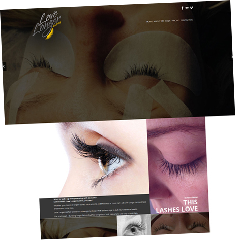
Running operations from a home studio-based in Bayside, Melbourne, Shannon is a certified technician for eyelash extensions application; who works dedicatedly to keep her clients 150% satisfied. From a small beginning with a few steps at a time, Shannon decided to market her business online of which the first step was to get a logo designed.
Objective
Logo Franchise was hired by the client to create a logo design that could truly depict the brand’s essence.
Approach
Our approach was to create something that attracts the women. We needed to remind our potential buyers about why they should opt for love longer lashes. After a detailed analysis of the business, the job was handed over to a unit of 2 designers, account manager and quality assurance manager. The eye-popping yellow we used, serves to almost illuminate the lashes, making them prominent to eyes, whereas the two-toned gray colored fonts represented a professional approach. The selection of this typeface was made to give a stylized look to the design. The new visual identity that we crafted meticulously for “Love Longer Lashes” includes a dynamic, full-color palette and cool yet engaging typeface. These elements work in collaboration to express the company’s agility and drive to make headway across every touchpoint. The design looks great when used on yellow and black backgrounds.
Achievement
The initial round of design concepts impressed Shannon and it did not take much from there to achieve the final piece of work. We got successful in creating an extremely minimalistic, yet easily recognizable depiction of client service. A smart design that our client was delighted with.


 © Copyright 2017 Logodelight. All Rights Reserved